Have you ever visited an online store and left within seconds without buying anything? Most customers do the same when a WooCommerce store feels confusing, slow or hard to use.
Many business owners invest time and money in launching an online store, yet sales stay low. The problem often does not come from products or pricing. It comes from poor store design.
A messy layout, weak navigation or complex checkout can push customers away before they even explore your products.
A WooCommerce online store should guide visitors step by step toward purchase. When design mistakes block that journey, conversions drop and trust fades.
Key Highlights:
- Use pop-ups only for clear actions
- Keep product images large and consistent
- Limit products per page and use filters
- Make the homepage and background clear and simple
Nettsidedesign creates WooCommerce stores that are simple, professional and easy to use. In this blog, you’ll learn the WooCommerce store design mistakes that hurt sales and user experience.
10 Common Visual and Layout Design Mistakes in WooCommerce Stores
Many WooCommerce stores lose customers because of small visual and layout mistakes that often go unnoticed. These design issues may seem minor, but they can affect usability, trust, and buying decisions.
- Poor Contrast Between Text and Background
- Using PopUps Without a Clear Purpose
- Using Too Many Fonts and Text Styles
- Adding Excess Multimedia Elements
- Displaying Too Many Products on One Page
- Using PDFs for Important Information
- Inconsistent Product Image Sizes
- Homepage Without Clear Direction
- Distracting Background Designs
- Using Small Product Images
1. Poor Contrast Between Text and Background
Contrast helps customers read content without effort. Some WooCommerce stores use colors that look stylish but reduce readability. Light text on light backgrounds or dark combinations makes product details hard to understand.
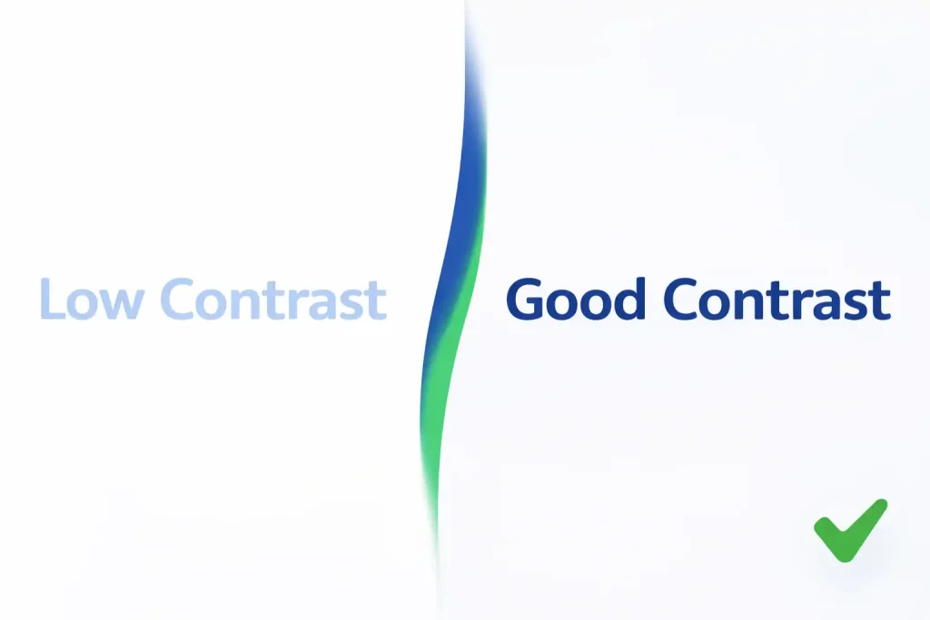
Customers should scan information without strain. Clear contrast improves accessibility and keeps the user engaged longer. Good contrast also helps users focus on important information such as prices, product details and call to action buttons.
2. Using PopUps Without a Clear Purpose
Pop-ups can help capture leads or promote offers, but many stores overuse them. When pop-ups appear for newsletters, discounts, surveys and announcements at the same time, visitors feel interrupted.
Pop-ups should support a clear call to action, such as a special offer or limited promotion. Too many interruptions break the shopping experience and push users away.
3. Using Too Many Fonts and Text Styles
Font variety can damage visual consistency. Many stores mix several font types, sizes, and heading styles across pages. This creates visual noise and weakens the brand identity.
A strong WooCommerce store usually sticks to:
- One primary font
- One secondary font
- Consistent heading structure
Consistency builds professionalism. It also makes the store easier to read and creates a more trustworthy shopping experience for customers.
4. Adding Excess Multimedia Elements
Videos, animations, sliders and moving banners may look attractive, but excessive multimedia slows performance and distracts users. Customers visit stores to explore products, not visual effects.
Heavy multimedia also increases loading time, especially on mobile devices. Use media only where it supports product understanding.
Too many moving elements can also shift customer attention away from important actions such as adding products to the cart. A balanced use of media keeps the shopping experience clean and focused.
5. Displaying Too Many Products on One Page
Showing a large number of products on category pages often overwhelms visitors. When customers see too many options at once, they struggle to decide where to start.
The long product grids also make pages feel crowded and reduce focus on individual items. Endless product listings can slow page loading and create a tiring browsing experience.
Instead, limit products per row, use filters or pagination and highlight best selling or featured items. Organized layouts help customers explore products comfortably and make purchase decisions faster.
6. Using PDFs for Important Information
Some stores upload product guides, policies or catalogs as PDFs instead of web pages. This approach often creates an extra step for users who want quick access to information.
PDFs interrupt navigation because users leave the browsing flow. They also perform poorly in mobile environments. Many customers close PDFs instead of returning to the store page.
Important information should exist as normal website pages so customers stay within the store experience. This keeps users engaged and improves overall usability across devices.
7. Inconsistent Product Image Sizes
Product images with different dimensions create an unbalanced layout. This inconsistency breaks the visual flow of product listings. Uneven sizing makes stores appear unprofessional and distracts shoppers while scrolling through listings.
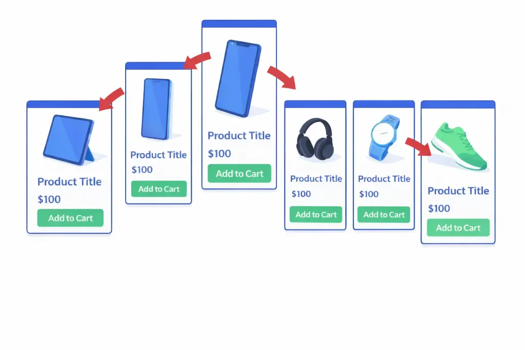
Customers may also find it harder to compare products side by side. Maintain consistent image ratios across all products to create a clean visual structure. Uniform images help present products in a more organized and trustworthy way.
8. Homepage Without Clear Direction
A homepage should explain what the store offers within seconds. Many WooCommerce homepages contain sliders, banners or messages without a clear focus. Visitors struggle to understand the brand or the next step.
A strong homepage should include:
- Clear headline
- Product categories
- Featured products
- Visible call to action
Clarity improves engagement. A well structured homepage guides visitors well toward exploring products and making a purchase.
9. Distracting Background Designs
Busy patterns or textured backgrounds compete with product visuals. This can make it difficult for customers to focus on the products themselves. Background should support content, not dominate it.
Strong patterns reduce focus on products and lower readability. A subtle background helps maintain a clean and professional appearance throughout the store.
Natural background helps products stand out and create a professional feel. They also improve the overall shopping experience by keeping attention on important elements like images and call to action buttons.
10. Using Small Product Images
Tiny product images reduce buyer confidence. Customers may hesitate to buy if they cannot clearly see the product details. Customers want to inspect products before purchase.
Small visuals prevent users from seeing details such as texture, color or quality. Limited image size can make products appear less trustworthy or lower quality. Use large, high resolution images with zoom functionality to improve purchase confidence.
Closing Thoughts
Design mistakes in a WooCommerce store can reduce sales, frustrate visitors and hurt your brand image. Focusing on clear layout, simple navigation and consistent design, store owners can help customers move from browsing to buying. Good design improves conversions, builds trust, keeps users on the website, and makes the brand look professional.
Improve Your WooCommerce Store Design
If your WooCommerce online store feels outdated or struggles to convert visitors into customers, design improvements can make a strong difference. Many businesses lose sales because of hidden usability problems that customers notice immediately.
Nettsidedesign designs WooCommerce stores that focus on performance, usability and customer experience. Our WooCommerce store design services include:
- Custom WooCommerce website
- WooCommerce store development
- Store redesigns and updates
- Product upload and setup
- WooCommerce plugin and extension
- Secure payment and shipping setup
Our team helps businesses build online stores that look professional, load fast and guide users toward purchase with confidence. Contact us and let’s get started.
Key Takeaways
- Make sure the text and background have good contrast.
- Use pop-ups only for clear actions, not for everything.
- Stick to one or two fonts and consistent headings.
- Avoid too many videos, animations, or sliders.
- Limited products per page and use filters or pagination.
- Do not use PDFs for important information; use web pages instead.
- Keep product image sizes consistent across all listings.
- Make the homepage clear with headlines, categories, featured products and call to action.
- Use neutral backgrounds that highlight products.
- Show large, high quality product images with a zoom feature.
FAQs
Do product images affect sales?
Yes, clear, high quality images with zoom options help customers understand products and trust your store more.
Should I use PDFs for product guides or policies?
No, PDFs interrupt browsing and don’t work well on mobile. Use regular web pages instead.
Does Image Size Matter?
Yes, small or inconsistent images make products look low quality. Large, high resolution images build trust.
How do background patterns affect my store?
Busy backgrounds distract users from products. Use neutral or subtle backgrounds to highlight your products.
Should I use multiple fonts on my store?
No, stick to one or two fonts and a consistent heading sizes to look professional and easy to read.