Are you losing customers because your WooCommerce online store does not work well on mobile devices? Many store owners focus on desktop design but forget how their website feels on a phone. Buttons feel small, pages load slow and users leave without buying.
This creates a real problem for your business. When visitors struggle to browse your store, they lose trust and move to competitors. A responsive WooCommerce design solves this by making your store easy to use on every screen.
Key Highlights:
- Responsive design improves shopping on all devices
- Mobile first layout and a good theme make navigation smooth
- Optimized images and fast pages keep users engaged
- Clean layout and fewer plugins make the store professional
Nettsidedesign helps businesses build WooCommerce online stores that work well on all devices.
In this blog, you’ll learn what a responsive WooCommerce is, why it is important, and how to create a responsive WooCommerce online store design.
What is a Responsive WooCommerce Design?
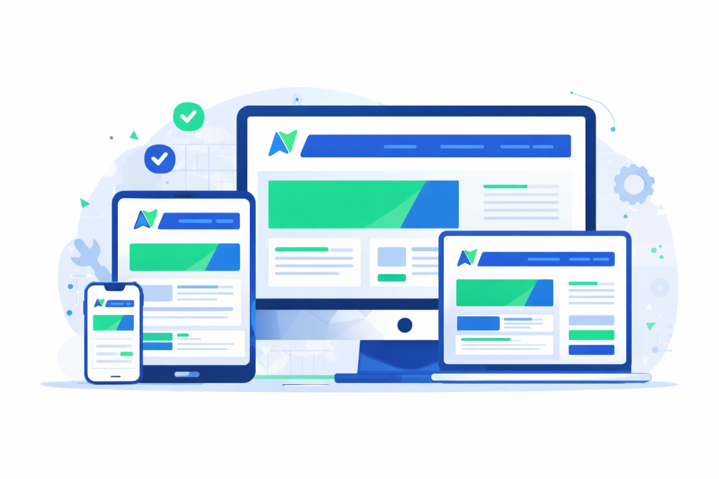
A responsive WooCommerce design means your store adjusts itself based on screen size. The same website works on desktop, tablet and mobile without creating separate versions.
The layout changes. Text stays readable. Images resize. Menus turn into mobile menus. Buttons stay easy to tap. Your store feels natural on every device.
Why Responsive Design is Important for WooCommerce?
Responsive design is not only about how your store looks. It affects how people interact with your website and whether they decide to buy or leave. A store that works well on all devices builds trust and feels easy to use.
Here is why responsive design matters:
- Most shoppers use phones: People browse and shop from mobile more than desktop. If your store feels hard to use on small screens, they leave.
- Google prefers mobile responsive websites: Search engines rank responsive stores higher, which means more visibility and organic traffic.
- Better user experience brings more sales: When users can scroll, tap and navigate easily, they feel comfortable buying.
- Lower bounce rate: Visitors stay longer when the layout fits their screen and loads fast.
- Higher conversion rate: Simple design and smooth checkout increase the chances of turning visitors into customers.
If your WooCommerce online store does not work well on mobile, you lose traffic, sales and trust at the same time.
10 Steps to Create a Responsive WooCommerce Online Store
Here are the important steps you should follow to design a responsive WooCommerce store that feels easy to use on every device.
- Choose a Fully Responsive Theme
- Design with a Mobile First Approach
- Keep Navigation Simple and Clear
- Optimize Images for Fast Loading
- Make Product Pages Mobile Responsive
- Use an Easy and Short Checkout Process
- Test on Real Devices and Browsers
- Improve Page Speed
- Avoid Unnecessary Plugins
- Fix Layout issues before launch
1. Choose a Fully Responsive Theme
Your theme is the base of your entire store. If the theme is not responsive, no amount of design work will fix the experience. Always select a theme that is built for WooCommerce and tested on mobile.
Before finalizing a theme, check:
- How product grids look on mobile
- If menus collapse properly
- If text stays readable on small screens
A clean and lightweight theme always performs better than a heavy one.
2. Design with a Mobile First Approach
Start designing for mobile users first because they form the biggest part of your audience. Mobile first design forces you to focus on essential elements like product images, price and buy button. When the mobile version works well, expanding it for desktop becomes much easier.
3. Keep Navigation Simple and Clear
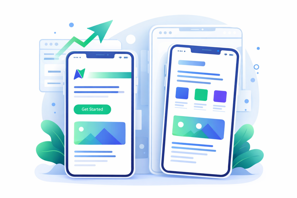
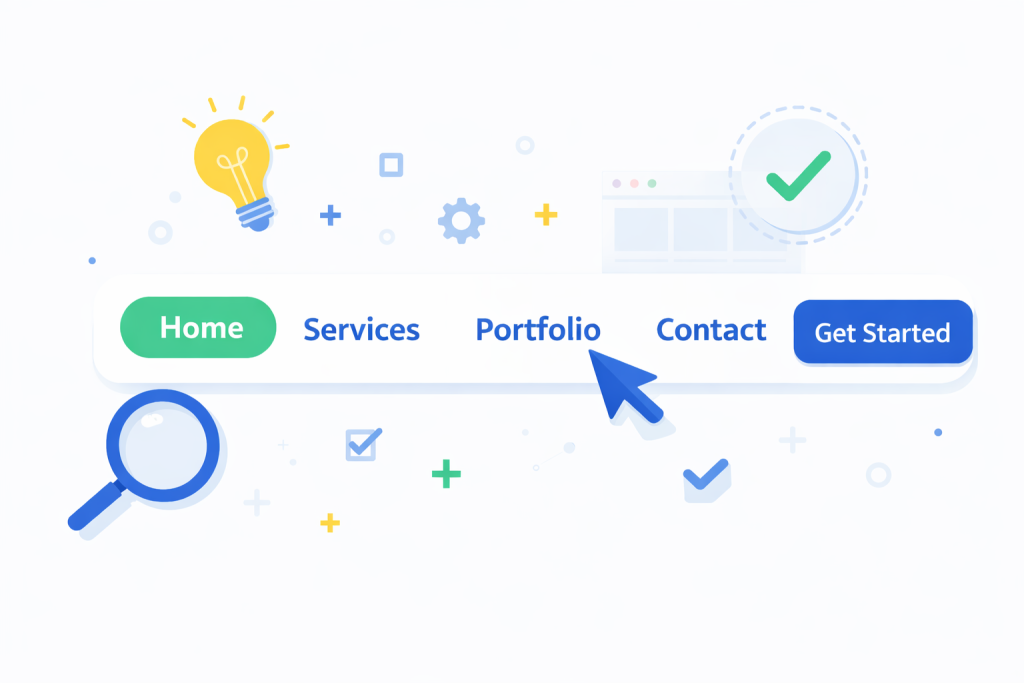
Navigation should help users move around without thinking too much. On mobile, long menus confuse people. Keep categories limited, use clear labels and place search and cart icons where users can easily find them. Simple navigation reduces frustration and increases product discovery.
4. Optimize Images for Fast Loading
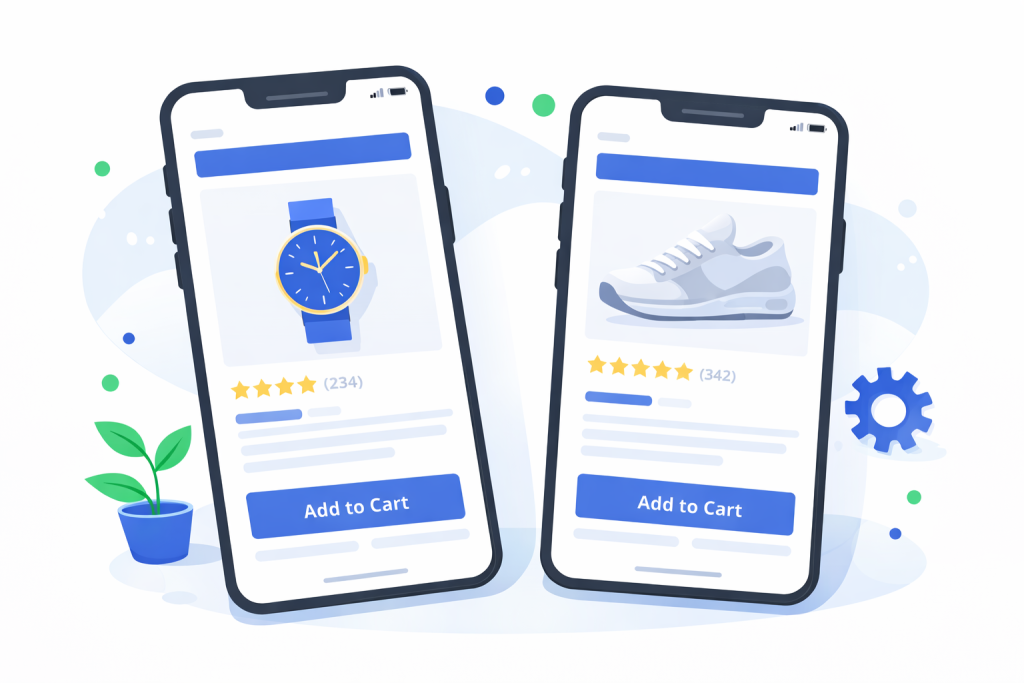
Images make your store attractive, but they also affect speed. Large files slow down mobile experience and push users away. Compress images before uploading and keep product image sizes consistent. A fast loading store always feels more professional.
5. Make Product Pages Mobile Responsive
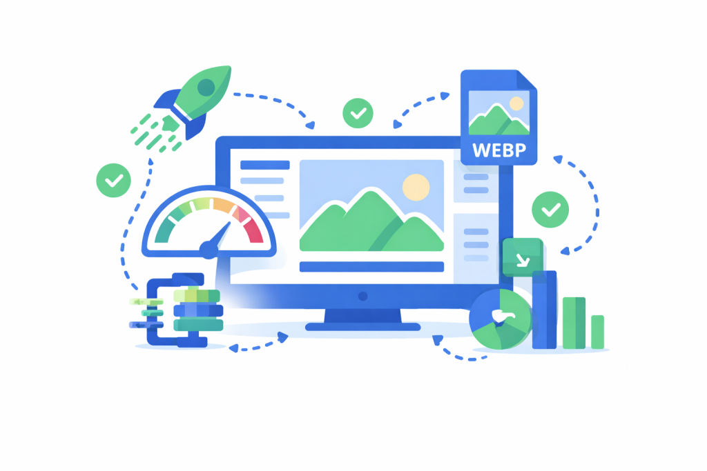
Product pages should feel clean and focused. Users should see important details without scrolling too much. Keep product titles short, show a clear price and place the add to cart button where thumbs can reach easily. Remove extra content that distracts users from buying.
6. Use an Easy and Short Checkout Process
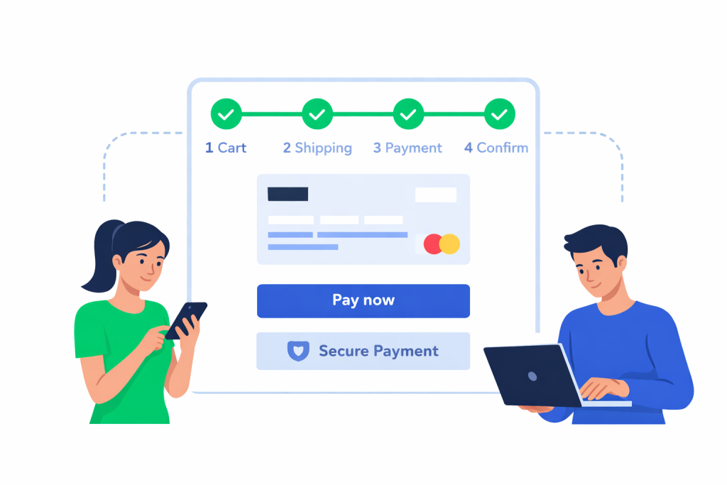
Checkout should feel smooth and stress free. Long forms and forced sign ups break the flow. Allow guest checkout, reduce fields and make sure users can complete a purchase within a few steps. Simple checkout increases trust and reduces abandoned carts.
7. Test on Real Devices and Browsers
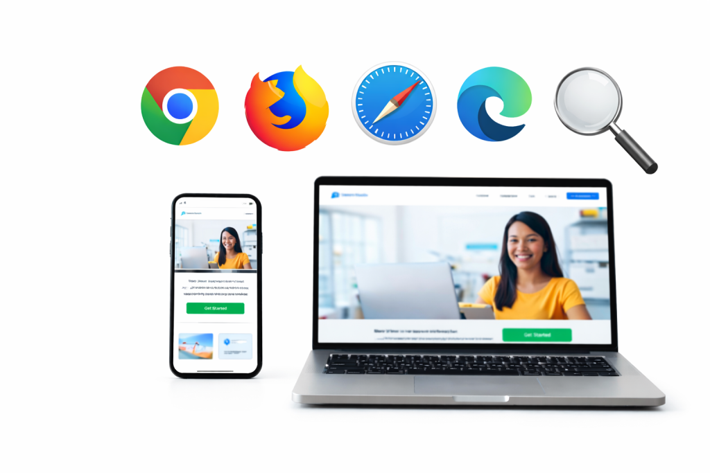
Preview tools are helpful but not enough. Always test your store on real phones and tablets. Click buttons, scroll pages and complete test orders. Real devices reveal issues that design tools often miss.
8. Improve Page Speed
Speed plays a big role in user experience. Even a responsive layout feels bad when pages load slow. Use good hosting, enable caching and remove unnecessary scripts. A fast store keeps users engaged and reduces bounce rate.
9. Avoid Unnecessary Plugins
Plugins add features, but also add load. Too many plugins cause layout issues and slow performance.
Ask yourself:
- Do I really need this plugin?
- Does it affect mobile design?
Only keep plugins that support business goals.
10. Fix Layout Issues Before Launch
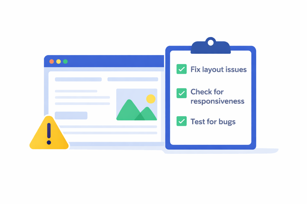
Before going live, review every page carefully. Check text spacing, button sizes, popups and forms. Small layout issues may seem minor, but they affect how users feel about your brand. A clean layout builds confidence and makes shopping easier.
Closing Thoughts
A responsive WooCommerce online store is not about beauty. It is about respect for users. When your store works well on every screen, you show customers that their experience matters. Good design feels invisible. Bad design feels annoying. Focus on comfort, not decoration.
Want to Build a Responsive WooCommerce Store?
Your online store should not push customers away. It should invite them to stay, browse and buy. A responsive WooCommerce design improves trust, sales and long term growth.
Nettsidedesign creates WooCommerce stores that work on all devices and focus on real user behavior. We design clean layouts, optimize speed and build stores.
If you want a store that looks good and performs better, our team can help you build it the right way. Contact us and let’s get started.
Key Takeaways
- Choose a responsive theme so your store works on all devices.
- Design for mobile first because most users shop on phones.
- Keep menus simple so users find products fast.
- Use optimized images to make your store load faster.
- Keep product pages clean and focused on buying.
- Make checkout short to avoid losing customers.
- Test your store on real phones and browsers.
- Improve speed because slow websites lose sales.
- Use fewer plugins to keep your store light.
- Fix design issues before launch for a better user experience.
FAQs
Is responsive design expensive for small businesses?
No, many responsive themes and tools are affordable and the long term benefits are worth the cost.
Does responsive design affect product loading speed?
Yes, a well built responsive design improves speed, while a poor design with heavy elements makes the store slower.
Can responsive design improve customer trust?
Yes, a store that works well on all devices feels more professional and reliable.
Should I use popups on mobile?
Use them carefully. Large popups on mobile often block content and frustrate users.
Can responsive design reduce support requests?
Yes, when users can navigate easily, they ask fewer questions about basic actions like checkout or payments.