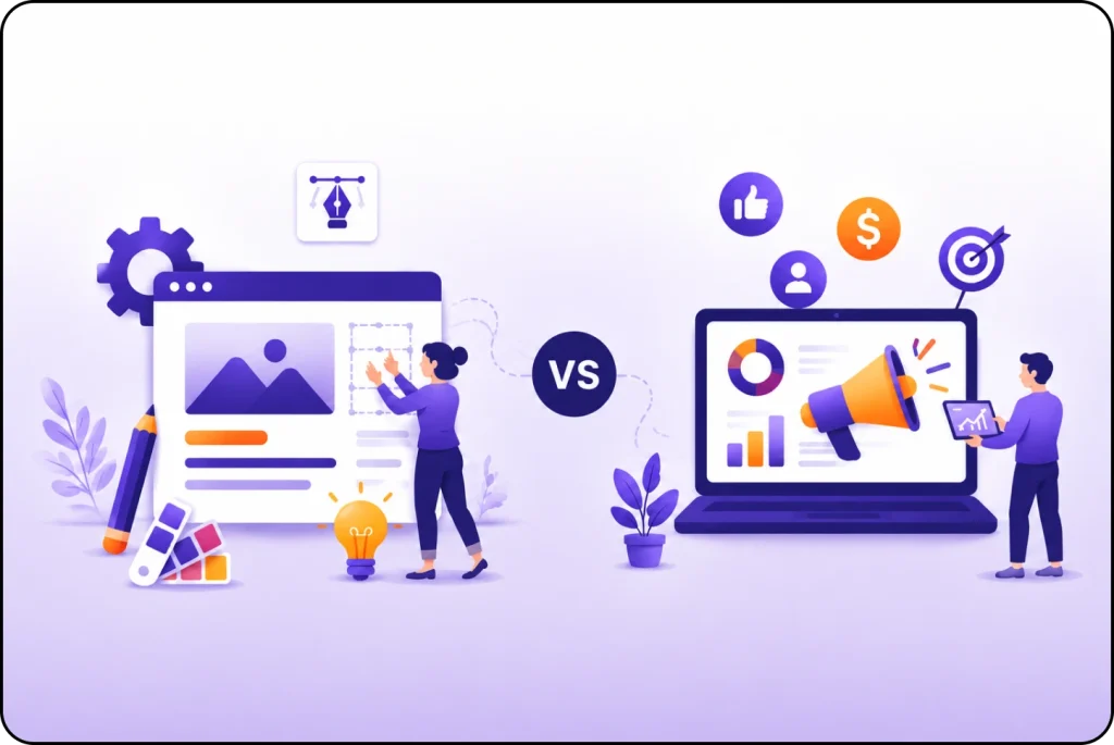
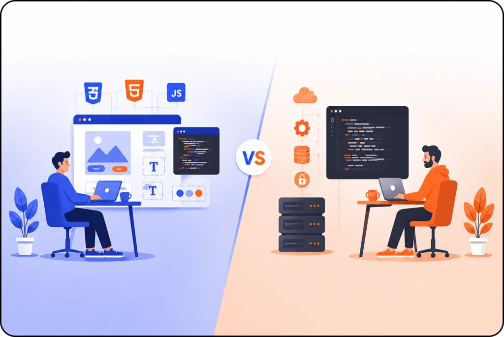
UI is what your website looks like. UX is how it feels to use. UI (user interface) covers the buttons, colours, fonts and spacing a visitor sees. UX (user experience) covers whether that visitor can actually find what they came for, trust your brand and finish what they started without getting stuck.
A lot of people think UI and UX mean the same thing. They don’t and for a business, that confusion is costly. A site that is hard to use loses sales. A website that works fine but looks cheap loses trust.
The two have to work together, so let’s look at how both user interface and user experience differ and why they matter to your business.
What UI Design Actually Covers?
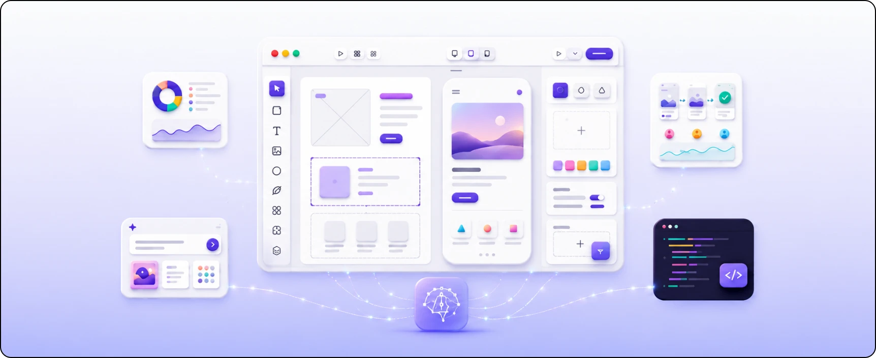
A User Interface (UI) is the surface layer through which human computer interaction occurs. Think of the visible layer: the shape of the button, the colour that tells you it’s clickable, the font size in your headline, the spacing between paragraphs, the icon next to a form field.
Good UI answers a simple question for the visitor: what do I do here and where do I click? When a “Buy now” button stands out from everything around it, that’s UI doing its job. When your menu looks the same on your phone as on your laptop, that consistency is UI, too.
UI leans on visual craft and a bit of psychology. Designers study how people read a page, which colours pull the eye, and what layouts people already expect from sites they use daily.
That last part matters more than it sounds. Visitors carry habits from every other website that they have used, so a checkout that behaves like the ones they know feels effortless. One that reinvents the wheel feels broken, even when it works fine.
What UX Design Actually Covers?
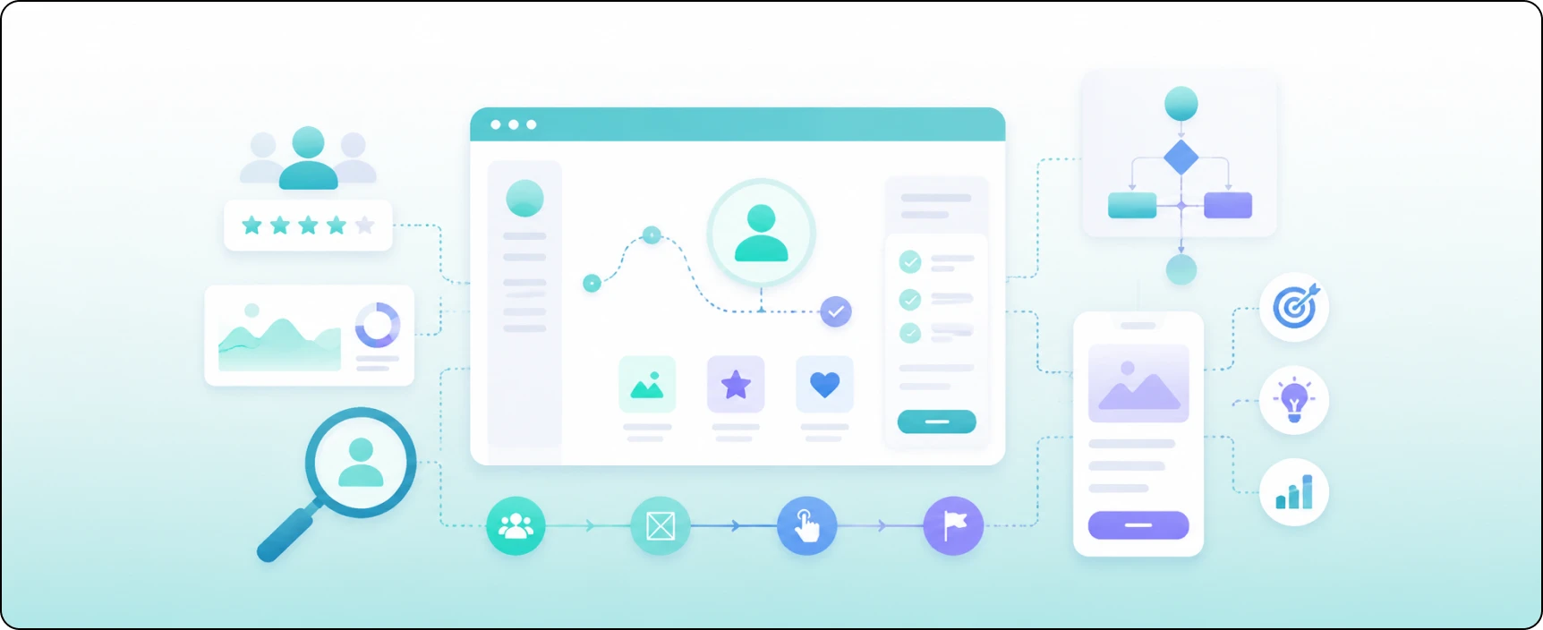
User Experience (UX) sits underneath the surface. It’s the full journey, from the moment someone lands on your site to the moment they leave and whether that journey made sense.
UX starts with research, not decoration. Before a single button gets styled, a UX designer wants to know who the visitor is, what they are trying to do and where they currently get frustrated.
That means interviews, surveys, watching people use the site and mapping out the path they take. The goal is to build around what people actually need, not what the business wishes they wanted.
A few things belong to UX:
- Structure: How your pages are organized so people find things fast.
- Flow: The steps someone takes to book, buy or contact you and how many of those steps you can cut.
- Clarity: Whether the words, labels and next steps make sense without a second guess.
- Testing: Putting rough versions in front of users to catch problems before launch, not after.
When a user experience website is designed well, visitors barely notice it because nothing gets in their way. They can find what they need, complete their task and leave with a positive impression. That seamless experience is exactly what good UX is meant to achieve.
Example to Understand the Difference
UI makes your site look right and UX makes it work right. For example:
Imagine visiting a restaurant. The UI is what you see, like the menu, the lighting, the table setup and how everything looks. The UX is how the visit feels, whether you get a table quickly, your food arrives on time, and it’s easy to get help from the staff.
A beautiful restaurant cannot make up for slow service. At the same time, great service feels less enjoyable if the place looks untidy. A good website works the same way. It needs both a clean, attractive design (UI) and a smooth, easy experience (UX) to keep people happy.
Difference Between UI and UX Design
Here is the difference between UI and UX design:
| Aspect | UI (User Interface) | UX (User Experience) |
| What it is | How your site looks | How does your site feel to use |
| Focus | Buttons, colors, fonts, spacing, icons | Structure, flow, clarity, ease of use |
| Main question | Where do I click? | Can I finish what I came to do? |
| Starts with | Visual design and branding | User research and testing |
| You notice it when | It looks polished (or cheap) | It feels smooth (or frustrating) |
| Job on your site | Earns trust at first glance | Turns visitors into customers |
Why the UI and UX Matter to Your Business
This is not just a debate between designers. The difference between UI and UX has a direct impact on your business and your revenue.
People won’t wait around. Users leave a site or app if it takes more than three seconds to load. That’s a UX problem before it’s ever a UI one. The prettiest interface on the market means nothing if visitors are already gone before it appears.
Good decisions come from data, not guesses. Norwegian digital businesses now rely on advanced analytics. They study how people use their websites and apps, then improve the design based on real user behaviour instead of assumptions.
One experience, every screen. Your visitors jump between phone, tablet and laptop, and everything should look and work the same. A shared design system keeps your colors, buttons and layouts consistent everywhere, which is why it’s now standard for any brand serving a multi device audience.
UX makes it easy for people to use your website and complete important tasks. UI makes your website look professional and builds trust. You need both. If one is good and the other is poor, visitors are more likely to leave and choose a competitor instead.
Closing Thoughts
Here is my honest view: most businesses spend too much on how a site looks and too little on how it works. It’s an easy mistake to make. A pretty homepage is easy to show off. A smooth checkout goes unnoticed, so it feels less impressive, even though it’s the part that quietly brings in the money.
If you’re not sure where to begin, begin with UX. Get the journey right and clear out anything that shows people down. Then add a clean UI that makes them trust you. This order works far better than the other way around and your customers will feel the difference before they can put it into words.
Turn Visitors into Customers
Your website has seconds to make an impression before someone decides to stay or leave. If your traffic is healthy but your sales are not, the gap is almost always sitting somewhere in your UI or UX and it’s usually fixable once you know where to look.
Nettsidedesign.no builds websites where the design and the experience pull in the same direction. We start by understanding your customers and how they move through your pages, then we shape both the look and the flow around that.
Contact us and let’s make your website work as hard as you do.
Key Takeaways
- User interface is what your website looks like and UX is how it feels to use.
- UI covers the visible stuff: buttons, colors, fonts, spacing and icons. It tells visitors where to click.
- UX covers the whole journey, from landing on your site to finishing what they came to do.
- Speed matters more than you think. Most people leave a site if it takes more than three seconds to load.
- Smart team design with data, not guesses. They watch what people actually do and adjust from there.
- Your site should feel the same on phone, tablet and laptop. Consistency across devices builds trust.