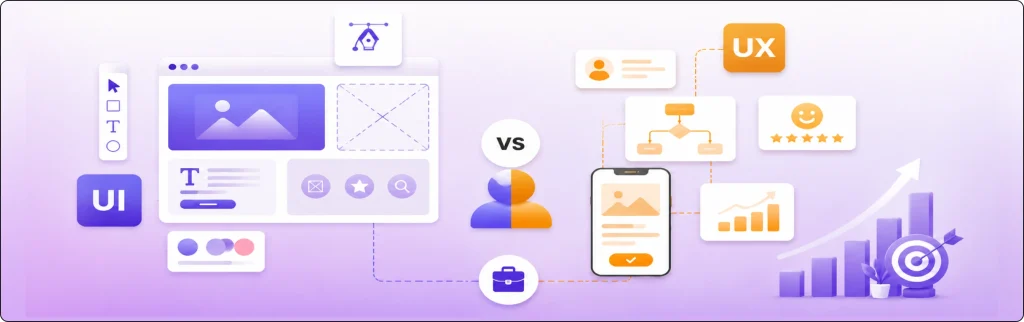
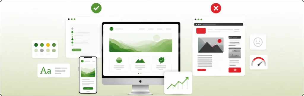
The web design trends that actually work in 2026 are AI supported web design, immersive 3D and WebGL, kinetic typography, dopamine design, voice search and voice interface, sustainable web design, Soft Interface Design and Micro Interactions and Accessibility and WCAG.
What to avoid is heavy 3D effects, glassmorphism, decorative motion and stacking every trend at once.
Web design is not about adding more effects, it is about building websites that feel clear, fast, useful and easy to trust. A website now shapes first impressions, supports SEO and turns visitors into leads.
People expect speed, clarity and accessible design from the first click, so the strongest trends this year are practical choices, not only visual ones.
Web Design Trends That Actually Work in 2026
Not every trend is worth the hype, but some are genuinely making websites better in 2026. These website trends help users, not just impress them.
1. AI Supported Web Design
AI is becoming a part of website design, but the websites that perform best are not the ones handing everything over to automation. They use AI in the right places to make the experience smoother and more useful.
This may include:
- Smarter on-site search
- Chatbot support for common questions
- Content suggestion based on user intent
- Product or service recommendations
- Layout testing based on behavior.
When used well, AI helps visitors move faster. It reduces friction, answers simple questions and shows more relevant content. AI should support the user journey, not replace human thinking and strategy.
2. Immersive 3D and WebGL
3D design and WebGL still have a place in 2026. They work well for products, spaces, technical services and premium brand experiences. Real estate, architecture, furniture, automotive and luxury brands can all use 3D in a smart way.
A well built 3D section can add depth and make a product easier to understand. But the value comes from focus. One strong visual feature can do more than a full website loaded with effects. If 3D slows the site or hides the message, it becomes a problem, not a strength.
3. Kinetic Typography
Text in motion is still growing, but the strongest examples are simple and controlled. Kinetic typography works when it highlights a message, supports a brand tone or helps users scan the page.
It can bring energy to a hero section, explain a product benefit or make a landing page feel alive. Movement should never make content harder to read. If visitors need extra effort to understand the message, the design has failed.
4. Dopamine Design
Bright colors, playful shapes, bold contrasts, and expressive visuals continue to appear throughout digital design. This trend is usually called dopamine design because it aims to create a fun, high energy feel.
In 2026, it works best for brands that want to feel fresh, creative or youth focused. But it needs control. Too many colors, too many movements and too many loud elements can turn excitement into confusion. The strongest version of this trend mixes bold personality with clean structure.
5. Voice Search and Voice Interface
Most users now search in natural language, especially on mobile and smart devices. That means websites need content structures that answer spoken queries in a direct way.
Voice friendly design is not only about voice assistants. It is about how content is written, organized and surfaced. Clear headings, FAQ sections, conversational phrasing and fast loading mobile pages all help.
Brands that prepare for voice search now will have a better chance of staying visible as search behavior keeps changing.
6. Sustainable Web Design
Sustainable web design is becoming a serious priority. It focuses on building lighter, faster, more efficient websites that use fewer resources. This is good for performance, user experience and brand trust.
A sustainable website usually includes:
- Compressed images and media
- Cleaner code
- Fewer unnecessary scripts
- Lighter page weight
- Better performance on mobile networks
Many businesses now understand that a faster site is not only good for SEO and conversions. It is also a smarter long term design choice.
7. Soft Interface Design and Micro Interactions
Neumorphism never fully took over, but softer surfaces still appear in 2026, mostly in buttons, toggles and app style dashboard. These soft shadows only help when they make a control easier to notice or press.
The stronger idea here is micro interactions, the small moments of feedback that tell the user something just happened:
- A button that shifts slightly when pressed, so the click feels confirmed
- A form field that shows a check when an email is typed correctly
- A cart icon that reacts when a product is added
- A smooth loading state instead of a frozen screen
These matters because they build trust and control. When a website reacts to what the user does, the experience feels responsive. The best micro interactions are quick, quiet and useful.
8. Accessibility and WCAG
Accessibility is no longer optional. Strong websites now plan for it from the start instead of adding it at the end. That means better contrast, readable text, keyboard support, alt text, clear forms, and screen reader awareness.
This matters even more in Norway. Research on Norwegian municipality websites found serious accessibility issues, with an average of 40 errors in the sample that was tested.
That is a strong reminder that accessibility is still not where it should be, even on important public facing websites.
A WCAG focused websites is not only better for people with disabilities. It is also better for older users, mobile users and anyone who want a clearer and easier browsing experience.
Website Trends to Avoid in 2026
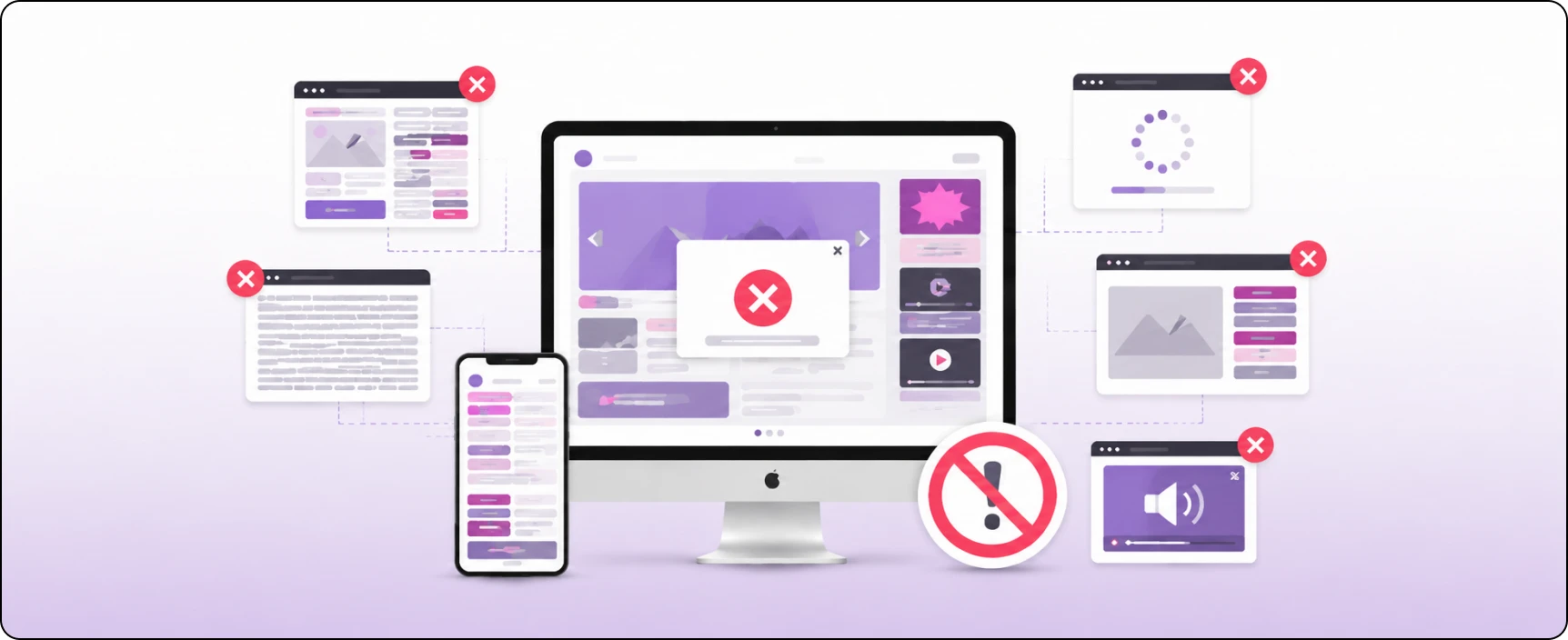
Not every trend is worth following. Some design choices look modern at first but end up slowing the site, confusing users or hurting trust. Here are the ones to be careful with in 2026:
Heavy 3D Effects
3D can be impressive, but too much of it creates friction. Heavy 3D may slow down the site, hurt mobile performance, and make the content harder to reach. If users need patience just to browse the homepage, the design is not doing its job.
Motion Used Only for Decoration
Animation should guide, explain or confirm an action. It should not exist only to make the page feel busy. Decorative motion usually distracts from the message and pulls attention away from what the visitor came to do.
Glassmorphism
Glassmorphism had a strong visual phase, but many websites pushed it too far. Frosted backgrounds and blurred cards can reduce readability and make interfaces less clear. In many cases, it looks stylish at first glance but is weaker in real use.
Fake Personalization
Users can tell when personalization is shallow. Generic recommendations, forced dynamic content and empty “personalized” experiences do not build trust. Real personalization helps the user. Fake personalization only tries to look smart.
Trend Stacking
One of the biggest design mistakes in 2026 is trying to use every trend at once. A website with AI widgets, bright gradients, animated text, layered cards, motion effects and 3D scenes can feel noisy. Good design is about making good choices.
Closing Thoughts
My view is simple: a website design trend is only worth following if it makes the website better for users. A trend should improve clarity, trust, speed or usability. If it only adds noise, it does not belong on a business website.
In 2026, the strongest websites will not be the most decorated ones. They will be the ones who feel sharp, clear and fast. That is what lasts longer than any design trend.
Build a Modern Website Design With Nettsidedesign
If your website feels outdated, slow, or hard to use, this is the right time to improve it. A modern website should do more than look current. It should help users trust your brand, understand your offer and take action without friction.
Nettsidedesign builds websites that combine modern design with business value. That means better structure, stronger mobile performance, accessible design, cleaner visuals, and smart choices that support growth. Contact us to get started.
Key Takeaways
- Use AI to improve the user experience, not to replace good design and strategy.
- Add 3D elements only when they help explain products or services.
- Keep animations and moving text simple so content stays easy to read.
- Use bold colors and creative visuals in a balanced way without overwhelming users.
- Write content that works well for voice search with clear and natural language.
- Build fast, lightweight websites by reducing unnecessary code, images and scripts.
- Use small interactive effects to give users helpful feedback as they browse.
- Make accessibility part of the design from the beginning, not an afterthought.
- Avoid outdated trends that slow websites, reduce readability or create confusion.