
Building a website takes more than choosing good colors and fonts. The layout matters. A clean structure makes your site look organized and easy to use. That’s where a grid system comes in. In this blog, we will explain how to design a website with a grid system and why it is important and how you can use it to build better websites.
What is a Grid in Web Design?
A grid is a set of horizontal and vertical lines. These lines help to place elements like text, images and buttons. Think of it like a guide that keeps everything in order. Designers use grids to align things and create balance.
The grid works like an invisible skeleton. You don’t always see the lines, but they shape how your site looks and feels. They guide the placement of content so everything stays neat. Without grid, your layout can feel off balance or confusing to users.
Importance of Grid in Web Design
Using a grid makes your website clear. Visitors can find it easier to read and move around. It also helps you build pages faster because you follow a clear structure. Benefits of using a grid system include:
- Better alignment: Everything is in order.
- Clean layout: No more messy or scattered elements.
- Consistency: Each page looks like part of the same site.
- Speed: Once the grid is set, placing content gets faster.
Whether you are designing a landing page or a blog, grids give your site a strong base.
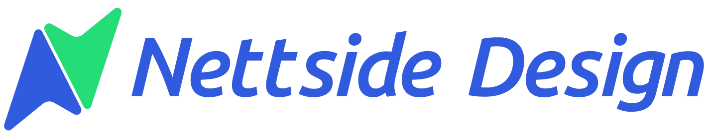
Types of Grids
Grids come in different styles. Each type has its use depending on the layout and the content. Let’s look at some you can try.
Baseline Grid
This grid aligns text by its baseline, not the top or middle. It helps keep line spacing even and makes text look neat and easy to follow. Baseline grid is best for Magazines, creative websites and online documents.
Manuscript Grid
The grid uses a large block area, often centered, to hold text or images. It is like a single column layout with fixed margins. The focus stays on the content, making it easier to read and follow. Manuscript grid is best for articles, blogs, long-form content and books.
Column Grid
This grid has equal width columns with spacing in between. It helps you place elements side by side and keep them aligned. It is the most used grid in web design. Column grid is best for websites, blogs, e-commerce layouts.
Modular Grid
This grid has both columns and rows, creating square or rectangular blocks. Each block holds a piece of content. It keeps things tidy and spaced. Modular grid is best for dashboards, portfolios, product galleries.
Hierarchical Grid
This grid is mostly found in web design. It does not follow equal spacing and changes based on how important each section is. Some parts get more space to stand out. Hierarchical grid is best for news sites, creative pages, magazine layouts.
Steps to Design a Website with a Grid System
You do not need to be a pro to use a grid. Follow these Steps to design a website with a grid system:
Set the Canvas Size
Start by choosing the width of your design. A common screen size for digital designs is 1920 by 1080 pixels. Most websites use a 12-column grid on a 1200px wide canvas. This gives enough room for different devices.
Pick a Column Count
Column divide your layout into parts. More columns give more flexibility. Fewer columns create simple layouts. A 12-column grid is common because it divides into 2, 3, 4 or 6 parts.
Add Gutters
The gutters are spaces between columns. They keep elements from sticking too close to each other. Use 20px to 30px gutters for a balanced look.
Define Margins
Margins are the blank spaces on the left and right sides. They keep your content from touching the edges of the screen. Margins give breathing space.
Plan Your Layout
Now, start placing your content. Use columns to align headers, images, and text. Keep spacing even. Follow the same grid on every page for consistency.
Make It Responsive
Your grid adjusts to different screens. On mobile, stack the columns or reduce them. Many designers switch to a 4 column or 2 column grid for phones.
Where to Use Grid In Web Design?
Grids work in every part of a website. No matter the page, grid helps you stay organized. Here are some areas you can apply them:
- Homepage layout
- Product listings
- Blog post design
- Contact pages
- Image galleries
- Headers and footers
Tips for Using Grids in Website Design
Keep these tips in mind when using a grid layout:
Keep It Flexible
Do not trap your design in strict lines. Use the grid as a base, but leave room for creativity. Let images or headlines break the grid when needed.
Use White Space
White space helps your design breathe. Don’t fill every block. Leave empty areas to draw attention to key content.
Test Across Screens
Your grid should work on laptops, tablets and phones. Test your design on different devices. Adjust the grid if something looks off.
Stick to a Rhythm
Try to repeat spacing patterns. For example, if you use 30px padding between sections on one page, use the same on others. This makes your site feel more connected.
Align Visual Elements
Even if elements are different in size, align them based on the grid lines. This keeps everything balanced and clean.
Mistakes to Avoid When Using Grids
Even with grids, mistakes can happen. Watch out for these:
- Overusing columns: Do not crowd your layout with too many columns.
- Skipping margins: Without side margins, your content can look squeezed.
- Breaking grid often: It is okay to go off grid sometimes, but do it for a purpose.
- Forgetting mobile view: Always check how your grid looks on small screens.
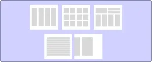
Tools to Build Grid Layout
You do not need to draw lines by hand. Many design tools make it easy to build grids.
- Figma
- Adobe XD
- Sketch
- InDesign
- Canva Pro
Want a Website with a Grid-Based Design?
Nettsidedesign.no builds websites using smart grid layouts. This helps your content stay organized and easy to read. Your visitors can find what they need without getting lost. Our team designs custom websites that look great on all screens, mobile, tablet or desktop.
If you want a site that feels modern and works well, we are here to help you make it happen. Contact us with our team.
Key Takeaways
- A grid is a set of lines that helps place content in order.
- Grids give structure and make pages look clean.
- Start with setting canvas size, columns, gutters and margins.
- A 12-column grid works for most types of websites.
- Use the right grid type based on the layout and content.
- Leave space between elements to improve reading.
- Check how the grid looks on mobile, tablet and desktop.
- Keep the same spacing and alignment on every page.
- Use design tools like Figma, Adobe XD, and CSS Grid.
- Follow the grid for layout but allow small creative changes.
FAQs
What is the purpose of a grid in website design?
A grid gives structure. It helps to align elements and keeps the layout organized.
Can I make a grid system in WordPress?
Yes, many WordPress themes use grid based layouts. You can also build custom grids with page builders or CSS.
Is the 12 column grid the best choice?
A 12 column grid is flexible and popular. It works for many screen sizes and layouts.
How do I make my grid responsive?
Use breakpoints and adjust the number of columns. Stack elements on smaller screens.
Do I need to use a grid for every website?
No, but it helps in most cases. If your design feels messy or hard to balance, a grid will fix that.

