A website speaks before words appear. The background tone, the shape of letters and the space between lines start a conversation in silence. Visitors may not notice these details, but they feel them. That feeling decides trust, comfort and interest.
In web design, colors and typography work like body language. They guide attention, suggest meaning, and influence decisions. When these elements align with human psychology, a website feels natural to use.
Users expect calm design, clear structure and honest presentation. This blog explains how colors and typography shape behavior, emotion and experience in web design and how to use them with purpose.
Why Psychology Matters in Web Design?
Every visitor brings emotions, habits and expectations. A good website respects these factors. It does not confuse users. It guides them.
Psychology in web design means understanding how people see, read and react. When design matches human behavior, users stay longer. They trust the brand. They convert.
Users prefer simple layouts, clear text and honest visuals. Loud colors and complex fonts often push users away. A calm and balanced design works better.
The Role of Color in Web Design
Color plays a deeper role than most people think. It not only decorates a website. It communicates meaning before users read a single word. When someone opens a page, color shapes their first emotional response. This response decides if they stay or leave.
In web design, color helps users understand structure. It separates sections, highlights important elements, and supports navigation. When used with care, color reduces confusion and builds confidence.
Color should feel calm and purposeful. Websites that rely on soft tones and clear contrast feel more reliable. Strong colors work best when used for guidance, not decoration.
Designers should also think about context. A public service website needs different colors from an online store. The role of color changes with purpose.
Color Psychology
Each color sends a signal to the brain. These signals are not random. They come from culture, nature and daily life.
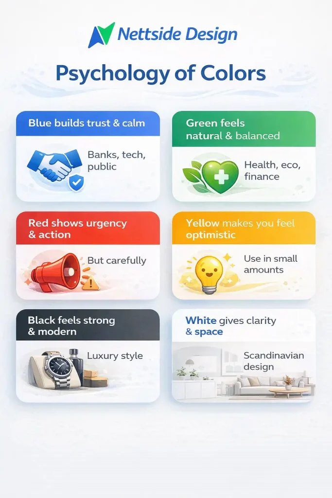
Here is how common colors work in web design:
- Blue builds trust and calm. Banks, tech companies and public services use it often.
- Green feels natural and balanced. It works well for health, sustainability and finance.
- Red shows energy and urgency. It fits calls to action but needs control.
- Yellow feels friendly and optimistic. It works in small amounts.
- Black feels strong and professional. It suits luxury and modern brands.
- White gives space and clarity. Scandinavian design relies on it.
Neutral tones and soft contrast work best. Too many bright colors feel stressful.
Using Colors to Build Trust
Trust grows when users feel safe. Color plays a major role in this feeling. Soft tones lower stress and help users focus on content.
Websites that use strong contrast without harsh colors feel stable. Light backgrounds with dark text improve readability. This approach aligns well with users’ expectations.
Trust also comes from consistency. When buttons, links, and highlights follow the same color logic, users feel in control. Random color use breaks confidence.
Designers should test colors on different screens. What looks calm on a desktop should feel the same on mobile.
Color and User Actions
Colors guide behavior. Buttons, links, and alerts rely on color contrast. A clear call to action button stands out from the background. It tells users where to click. The color should fit the brand but still catch attention.
For example:
- Green buttons suggest safety
- Blue buttons feel stable
- Orange buttons feel inviting
The key is contrast, not brightness.
Typography in Web Design
Typography controls how content feels while reading. It affects comfort, trust, and understanding. Even strong content fails when typography feels heavy or unclear.
Fonts influence pace. Some fonts feel fast and modern. Others feel slow and formal. The right choice depends on the message and audience.
Web users value clarity. They expect text that feels open and easy to follow. Fonts should never compete with content. They should support it quietly.
Typography also shapes professionalism. A well chosen font shows care and attention. Poor typography signals low quality.
How Fonts Affect User Psychology
Fonts carry emotion. Users often feel a website before they understand it. Typography sets that feeling. A clean grotesque font feels modern and honest. It supports digital reading and works well across devices. This is why many brands choose it.
Serif fonts feel serious and established. They fit institutions and long form content but need careful spacing on screens. Font weight also matters. Thin fonts feel elegant but may hurt readability. Balanced weights feel stable and clear.
Readability Comes First
Users scan content. They do not read every word.
Good typography helps scanning:
- Clear font size
- Enough line spacing
- Short paragraphs
- Simple font styles
Avoid decorative fonts for body text. They slow down reading and cause strain.
Font Size and Hierarchy
Hierarchy guides the eye. Headings show importance. Body text delivers details. A clear structure helps users understand content fast. Use:
- Large headings
- Medium subheadings
- Simple body text
Do not rely on color alone. Size and spacing also define hierarchy.
Line Length and Spacing
Line length affects reading speed and comfort. When lines run too long, the eye struggles to return to the next line. This causes fatigue. When lines feel too short, reading breaks too often and the flow disappears.
A balanced line length helps users read without effort. It keeps attention steady and reduces strain. This matters even more on content heavy pages such as blogs, service pages, and guides.
Spacing plays an equal role. Proper line height gives text room to breathe. Tight lines feel crowded. Wide spacing feels open and calm. Users process information faster when the text feels relaxed.
White space around paragraphs, headings, and sections supports focus. It separates ideas and makes scanning easier. Scandinavian design treats space as part of the design, not as a gap. Empty space guides attention and improves understanding.
This approach matches user expectations. Clean layouts with balanced text blocks feel trustworthy and professional.
Choosing the Right Font Pair
Font pairing creates rhythm and structure. Headings need presence. Body text needs comfort. Using separate fonts for each role helps content feel organized. A common and effective approach is to pair a strong, clear font for headings with a neutral, easy to read font for body text. This creates contrast without distraction.
Simplicity matters. Too many fonts create noise and confusion. Most professional websites work best with one or two fonts. This keeps the visual language clear. Mood alignment is important. Fonts should feel related. A modern heading font pairs well with a clean body font. A formal heading needs an equally serious body font.
Consistent font pairing strengthens brand identity. When users see the same typography across pages, the website feels stable and intentional.
Typography and Brand Identity
Typography gives a brand its voice. Before users read the message, the font already speaks. It suggests tone, values, and intent.
A legal firm needs typography that feels stable and confident. Clean lines, balanced spacing, and classic structure support trust. A creative studio can use more flexible typography to express ideas, personality, and movement. Each choice sends a clear signal.
Fonts should reflect what the brand stands for. A modern tech company benefits from clean and precise typography. A lifestyle brand may choose softer shapes that feel warm and open. When typography matches values, the brand feels honest.
Consistency strengthens recognition. Using the same fonts across the website, emails, and marketing materials creates familiarity. Users begin to associate the font style with the brand itself.
Changing fonts often breaks this connection. Strong brands stay consistent. Over time, typography becomes part of the identity, just like color and logo.
The Psychology of Layout and White Space
Layout defines flow. It tells users where to look first and what to do next. A strong layout feels natural and predictable. White space improves comprehension. It gives content room to breathe. Users process information faster when elements are not crowded.
Design often uses generous spacing. This reflects clarity, honesty, and calm thinking. A spacious layout shows confidence. Good layout also supports accessibility. Clear sections help users with different needs navigate with ease.
Common Mistakes in Color and Typography
Many websites fail not because of weak content, but because of small design mistakes. These issues affect how users feel and how long they stay.
- Low color contrast makes text difficult to read and strains the eyes
- Using too many fonts creates confusion and weakens visual clarity
- Small text size reduces comfort, especially on mobile screens
- Bright or harsh backgrounds distract users from the message
- Inconsistent styles break trust and make the design feel unplanned
Avoid design trends that harm usability. Clear colors and readable typography always create a better user experience.
Design with purpose, not guesswork
Your website has to do more than look good. It must feel right, guide customers, and build trust from the first second. Colors, typography, and spacing work together to shape how users enjoy your logo. When those factors align with user psychology, your website becomes easier to use and easier to keep in mind.
At nettsidedesign.no, we design websites with real users in mind. We focus on clear typography, calm color palettes, and balanced layouts that fit user expectations. If you want a website that feels professional, trustworthy, and easy to navigate, our team is ready to help you create a design that works. Contact us and let’s get started.
Key Takeaways
- Colors affect how users feel before they read any text
- Calm and soft colors work best for Norwegian websites
- Good color contrast makes content easy to read
- Fonts shape how professional and trustworthy a brand feels
- Simple fonts improve reading on all devices
- Clear font size and spacing help users scan content faster
- White space improves focus and reduces visual stress
- Using too many fonts or colors creates confusion
- Consistent typography builds brand recognition
- Design that follows human psychology keeps users longer
FAQs
How many colors should a website use?
Most websites work best with two or three main colors. This keeps the design clean and easy to understand.
Does typography affect SEO?
Typography does not directly affect rankings, but clear fonts improve readability and user experience, which supports SEO.
What font type is best for mobile users?
Sans-serif fonts are best for mobile screens because they stay clear at small sizes.
Why does my website feel tiring to read?
Poor spacing, small text, or low contrast can make reading uncomfortable.
Can changing fonts improve conversions?
Yes. Clear and trusted typography helps users feel confident and take action.