
Is Your WooCommerce Store Losing Sales Without You Knowing? You worked hard to launch your online store. You added products, wrote descriptions, and shared your link on social media. People visit your website. They browse. They even add products to the cart. But then… they leave.
This is the real problem many store owners face. The issue is not always your product or price. It is often the user experience. If your WooCommerce store feels confusing, slow, or hard to use, customers will not stay. And if they do not stay, they do not buy.
You can fix this. With the right design choices, you can turn visitors into buyers and buyers into repeat customers.
Key Highlights
- Simple design increases trust and sales
- Fast loading speed reduces cart abandonment
- Clear navigation helps users find products faster
- Mobile responsive layout is no longer optional
A well designed WooCommerce online store builds confidence and makes shopping easy. Nettsidedesign sees that design is not just about looks. It directly affects revenue.
In this blog, you will learn how to design a WooCommerce store that keeps users engaged and boosts sales.
What is WooCommerce UX?
WooCommerce UX means the overall experience a customer has while using a WooCommerce online store. It includes how easy it is to browse products, find information, add items to the cart and complete checkout.
Good UX makes the store feel simple, fast and clear. Users should not feel confused or lost. They should understand where to click and what to do next without thinking too much.
Strong WooCommerce UX focuses on clean design, smooth navigation, mobile responsiveness, fast loading speed and a simple checkout process.
When these elements work well together, customers feel comfortable and confident while shopping. This leads to more sales, fewer abandoned carts and better customer satisfaction.
Why WooCommerce UX is Important?
WooCommerce user experience is important because it shapes how customers feel when they visit your store. A visitor forms an opinion about your website in seconds. If the layout looks messy or the pages load slowly, trust drops immediately. Clear structure and smooth flow keep users engaged and focused on shopping.
Strong UX also removes friction from the buying journey. Customers can move from the product page to checkout without confusion. They do not struggle with forms or hidden costs.
When the experience feels simple and reliable, people complete their purchase and often return again. WooCommerce UX matters because of:
- Higher conversion rates
- Lower cart abandonment
- Better mobile usability
- Faster decision making
- Stronger customer trust
- More repeat purchases
Good UX supports business growth by making every step of the shopping journey clear and stress free.
Best Practices for WooCommerce User Experience in 2026
User expectations continue to rise in 2026. Online shoppers want speed, clarity and control. They do not tolerate slow pages or confusing layouts. If your WooCommerce online store does not meet modern standards, customers will move to competitors.
Below are the most important UX best practices you should follow this year:
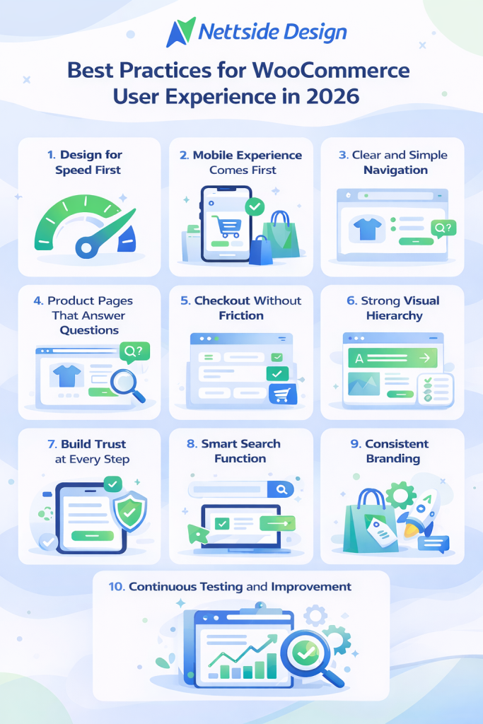
1. Design for Speed First
Speed is no longer a technical detail. It shapes the entire user experience. A delay of even a few seconds can reduce conversions.
Focus on:
- Lightweight themes
- Optimized images (WebP format)
- Fewer plugins
- Quality hosting
- Caching and CDN setup
Users expect instant results. A fast store builds trust from the first click.
2. Mobile Experience Comes First
Most customers shop from their phones. Your store must feel natural on small screens. Buttons should be easy to tap. Text should be readable. Menus should not feel crowded. Mobile UX is not a smaller version of desktop design. It needs its own layout thinking.
3. Clear and Simple Navigation
Navigation should guide users without confusion. Avoid complex menus or too many categories. Keep labels simple and familiar. Users should reach any product within a few clicks. Add search and filters to support quick browsing.
4. Product Pages That Answer Questions
Your product page is where decisions happen. It must remove doubts.
Include:
- Clear product title
- High quality images
- Visible price
- Stock availability
- Short, benefit focused description
Add reviews near the purchase button to support buying decisions.
5. Checkout Without Friction
Checkout should feel smooth. Long forms reduce conversions. Hidden costs create frustration. Allow guest checkout. Show the total price early. Keep the process short. Add a progress bar so users know how many steps remain. A clean checkout increases completed orders.
6. Strong Visual Hierarchy
Users scan before they read. Structure your content so important elements stand out. Use headings, spacing and contrast wisely. Keep paragraphs short. Highlight prices and call to action buttons clearly. Good hierarchy guides the eye naturally.
7. Build Trust at Every Step
Trust decides whether someone buys or leaves. Show return policies clearly. Display contact details. Add secure payment badges. Customer reviews increase confidence. Real feedback often influences decisions more than product descriptions. Clear shipping information and honest pricing also reduce hesitation and make customers feel secure before checkout.
8. Smart Search Function
Search is powerful in larger stores. Many customers prefer typing instead of browsing categories. Use predictive search with instant suggestions. Show product images in results. Handle spelling errors smoothly. When users find items faster, they buy faster.
9. Consistent Branding
Your WooCommerce store should reflect your brand identity on every page. Colors, fonts and tone must feel unified. Inconsistent design creates doubt. Consistency builds professionalism and recognition. Brand clarity strengthens long term customer loyalty.
10. Continuous Testing and Improvement
User behavior changes. What works today may not work next year.
Track:
- Conversion rates
- Bounce rates
- Cart abandonment
Test:
- Layouts
- Buttons positions
- Page structure
Small improvements can lead to measurable growth.
Closing Thoughts
A successful WooCommerce store grows when customers feel comfortable from the first click to the final payment. Clear structure, smooth navigation and honest information create comfort. When users do not face friction or doubt, they move forward with confidence. Strong UX is not an extra advantage in 2026; it is the standard every online store must meet.
Improve Your WooCommerce Online Store
If your WooCommerce store no longer reflects your brand or struggles to convert visitors, it is time to take action. A refined layout, faster performance and a smoother checkout process can transform how customers interact with your business. Even small improvements in structure and clarity can lead to stronger engagement and higher sales.
Nettsidedesign creates a WooCommerce store design around real user behavior and business goals. We focus on speed, usability and clean design that support growth. Let our team help you build a store. Contact us.
Key Takeaways
- A clean and simple design makes shopping easy.
- Fast loading speed keeps visitors on your store.
- Mobile responsive design is necessary for customers.
- Clear navigation helps users find products.
- Product pages answer questions and remove doubts.
- A short and simple checkout increases orders.
- Customer reviews build confidence and trust.
- Smart search and filters improve product discovery.
- Consistent branding makes your store look professional.
- Regular testing helps improve conversions over time.
FAQs
What is the difference between WooCommerce UI and UX?
UX focuses on how easy it is for customers to navigate your store, find products and complete purchases. UI is about how your store looks, including colors, buttons and layout. Both matter, but UX affects whether people buy.
How can I test my WooCommerce store’s UX?
Use real user testing, analytics and tools like PageSpeed Insights or Hojtar.
Can customer reviews improve UX?
Yes, Reviews show real opinions, help answer questions and give buyer confidence. They make the shopping experience smoother and more trustworthy.
How can I make navigation easier for large stores?
Use simple categories, filters, breadcrumbs and a search bar. Avoid too many submenus and make popular products easy to find from the homepage.
Do themes affect WooCommerce UX?
Yes, good themes improve speed, layout and mobile use.